Background
As one of Austin’s premier luxury home builders, Jenkins strives to provide each and every client with a well-crafted home designed around their individual needs, desires and dreams.
My Role
- Content Strategy
- UX Design
- Web Design
The Challenge
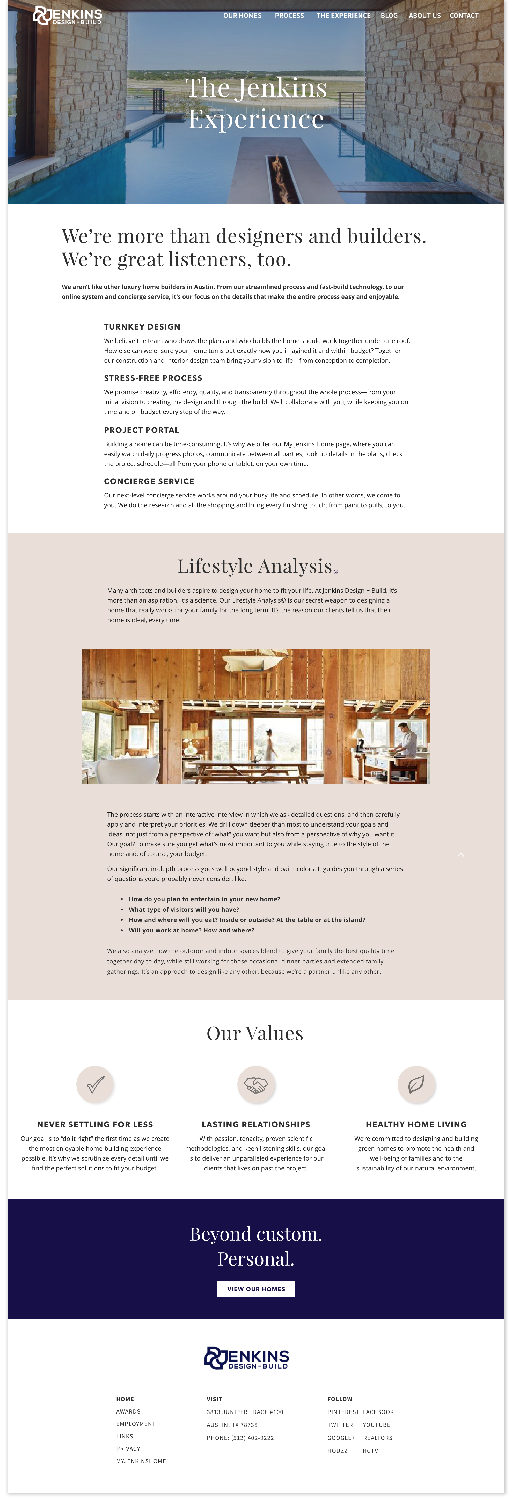
Jenkins needed their website to mirror what they provided to their clients. A one of a kind experiences that focused on the custom nature of each and every element. Jenkins also had quite a lot of information to provide to their future customer, and quite a few stories of success to share.
The Approach
The work consisted of lots of research into their existing content. This meant not just the copy and photos of their existing website, but also how they talk to their customers. Because each of their homes were one a kind it was important that the unique qualities were put front and center on each page of the website. The typography, color palette, and language needed to reflect the multi-million price point. This design is from my work as an Intern at Ampersand Agency.
Process
Long Term Goal
To find the long-term goal for Jenkins we asked a series of questions related to the website.
Why are we doing this?
- Improve the look and feel of company.
- To provide potential customers with easy to read information on the Jenkins Design + Build process.
- Cultivate relationships with clients.
- Showcase the beatiful work that Jenkins has created.
Where do we want to be in 6 months to a year?
- More unique clients.
- Generate more business.
- Winning more awards.
- Have a site that clients and staff can use as a resource.
How can we fail?
- Doesn't stand apart from competitors.
- Information too hard to understand.
- Website doesn't convey the right price point.
Create a space the showcases Jenkins beautiful work and emphasizes each unique quality and time spent with every client.
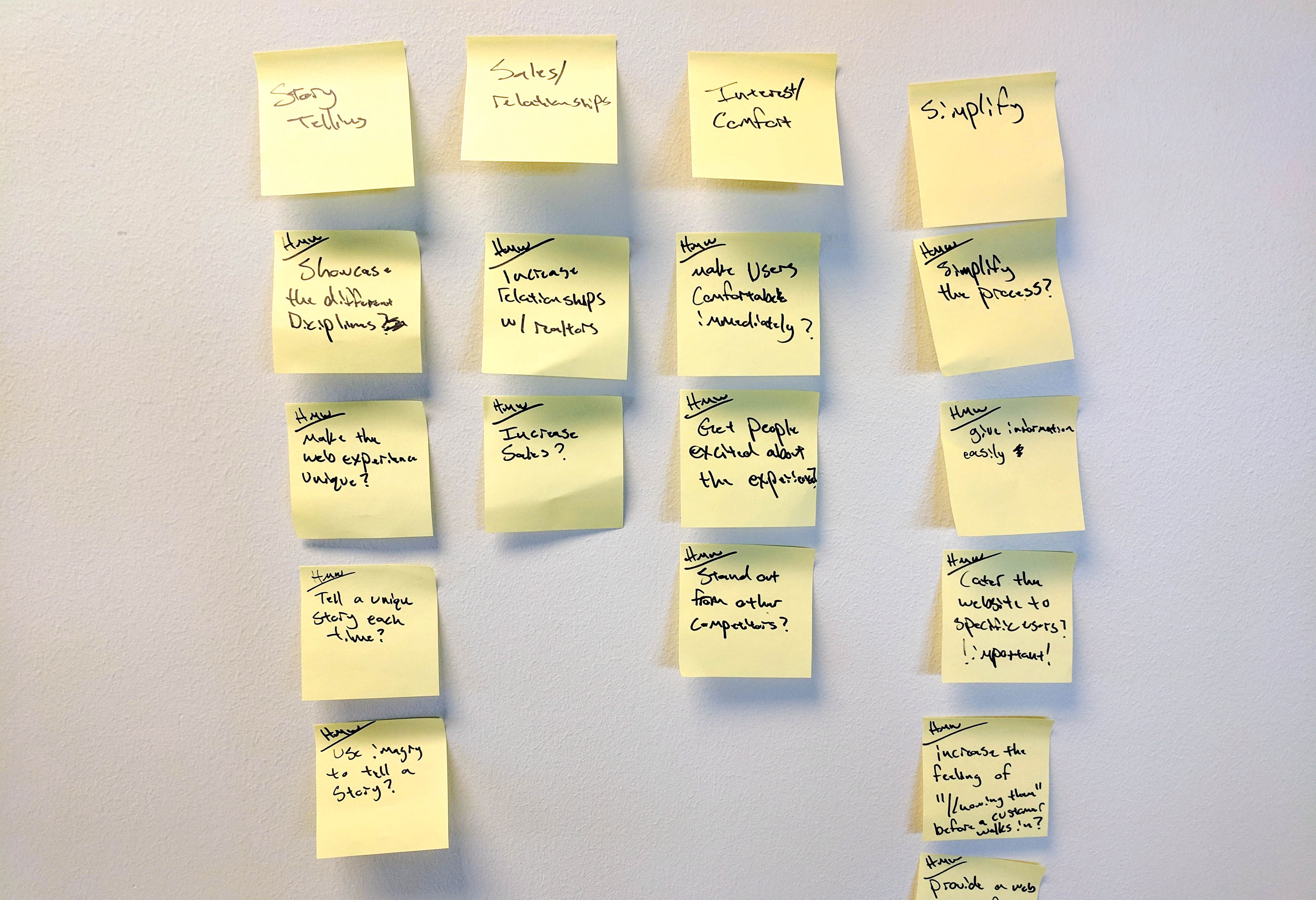
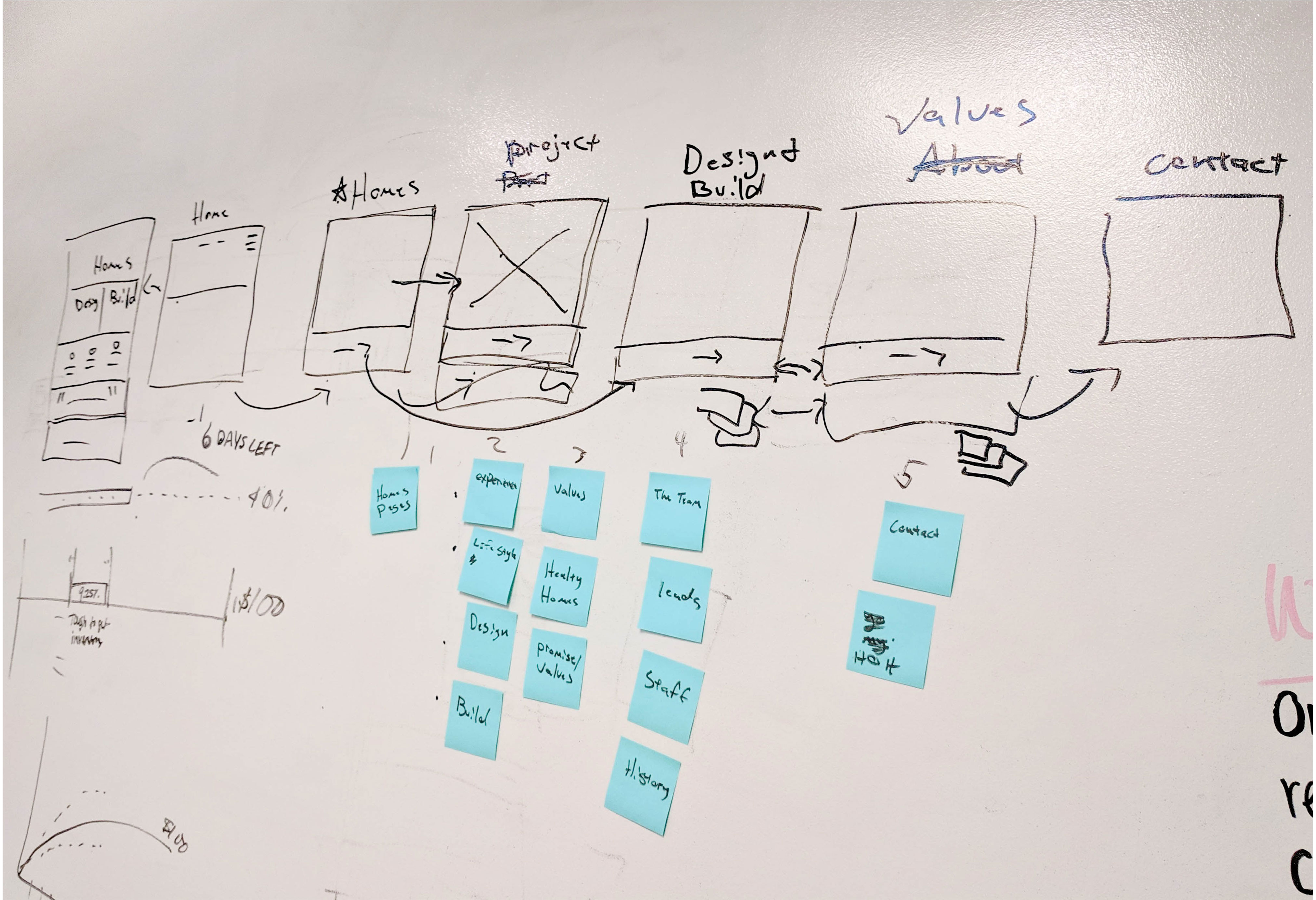
We started with a brainstorming whiteboard session using the Sprint process. We thought of limitations, failures, successes, user flows, site maps, and existing page organization.
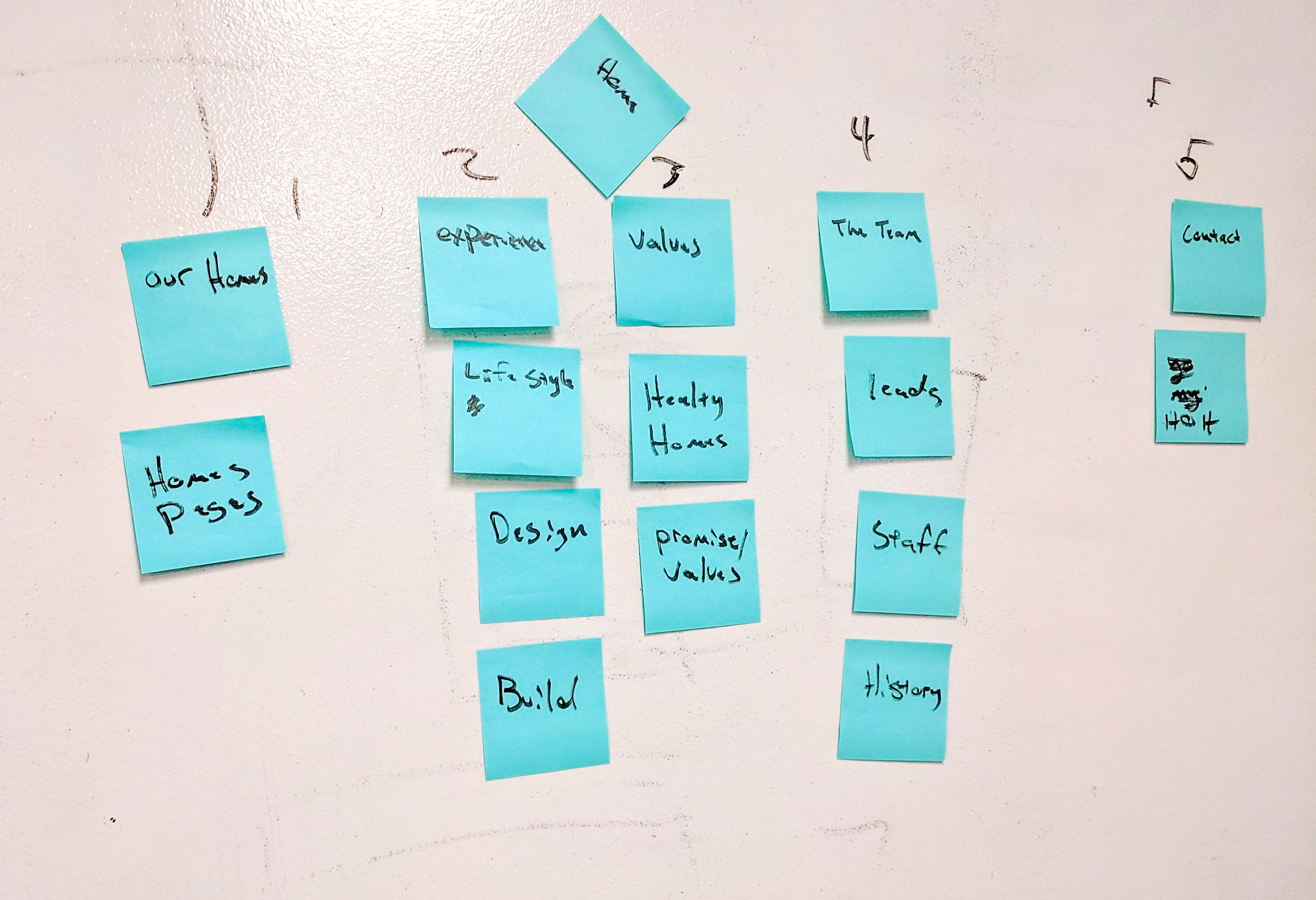
Information Architecture
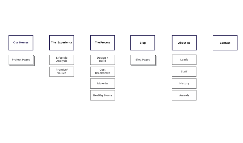
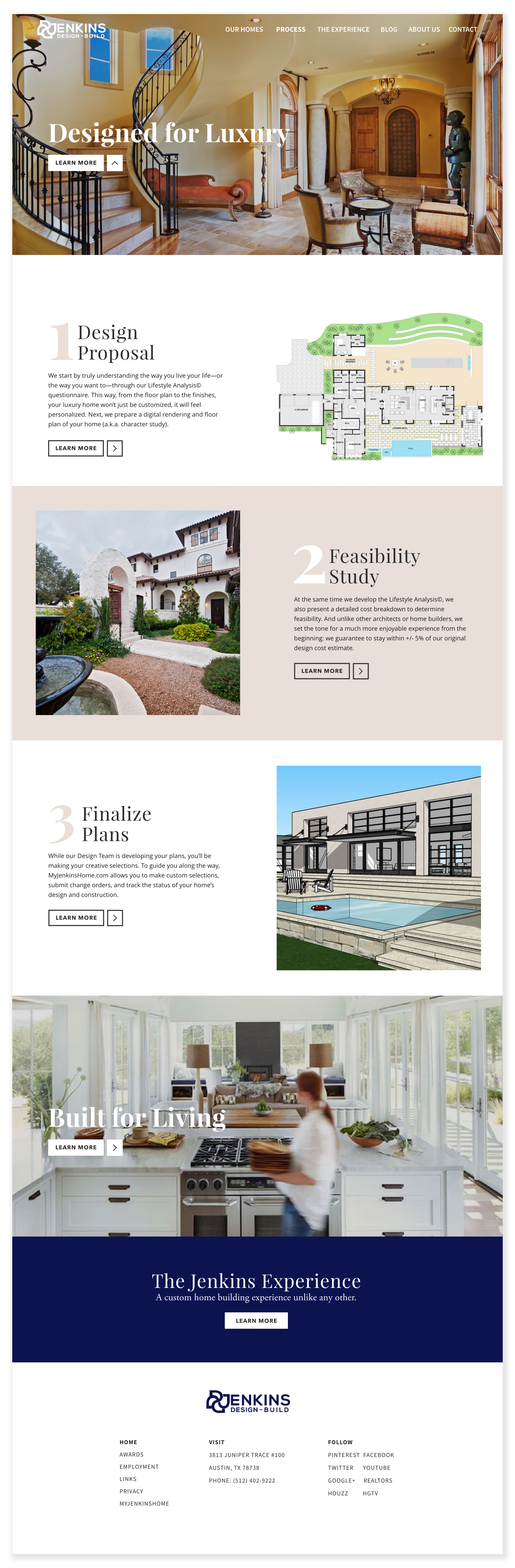
Jenkins is a company with a lot of experience. They build world-class homes and have done so for many years. Over that time, they developed a process for their clients to produce the best result possible. The only problem was the presentation of the information. It could be described in two words: too much. We took their process, images, and features for their clients and made them easy to read, see, and understand.
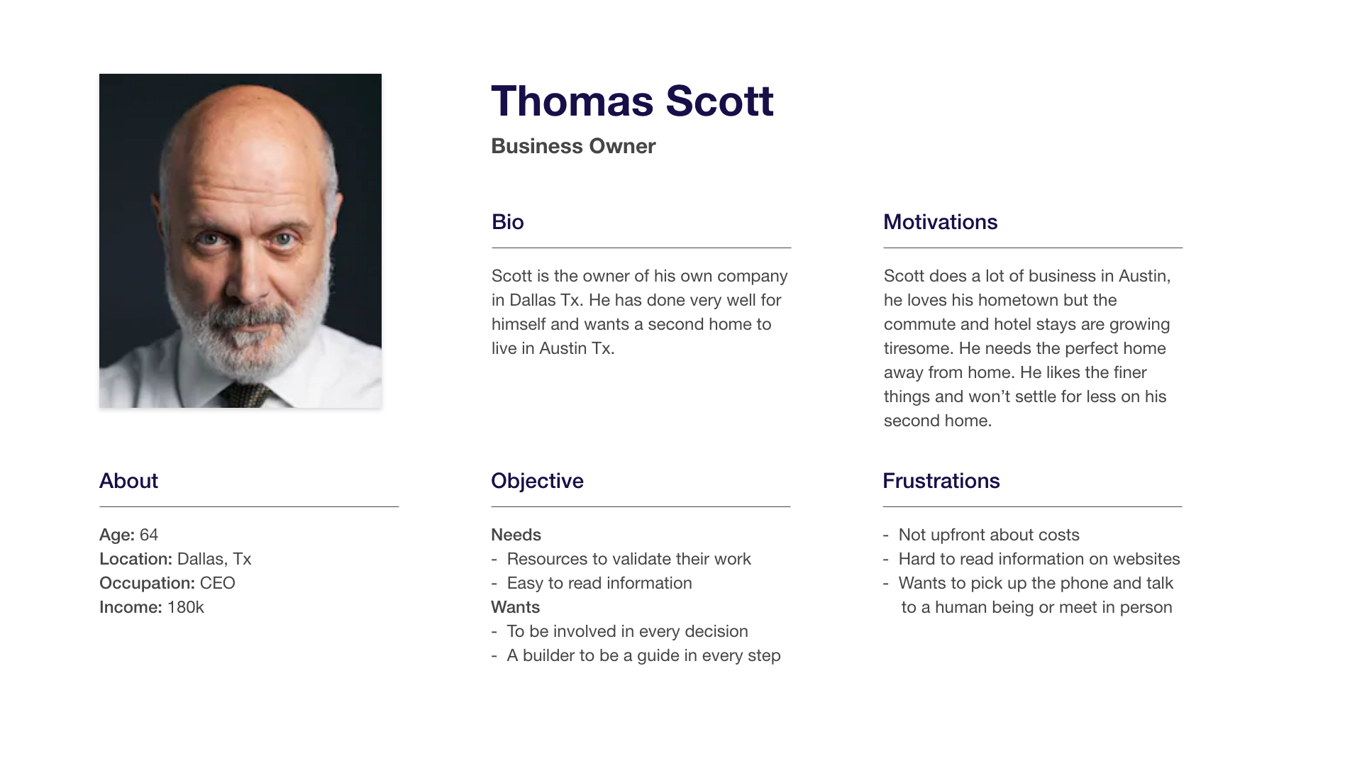
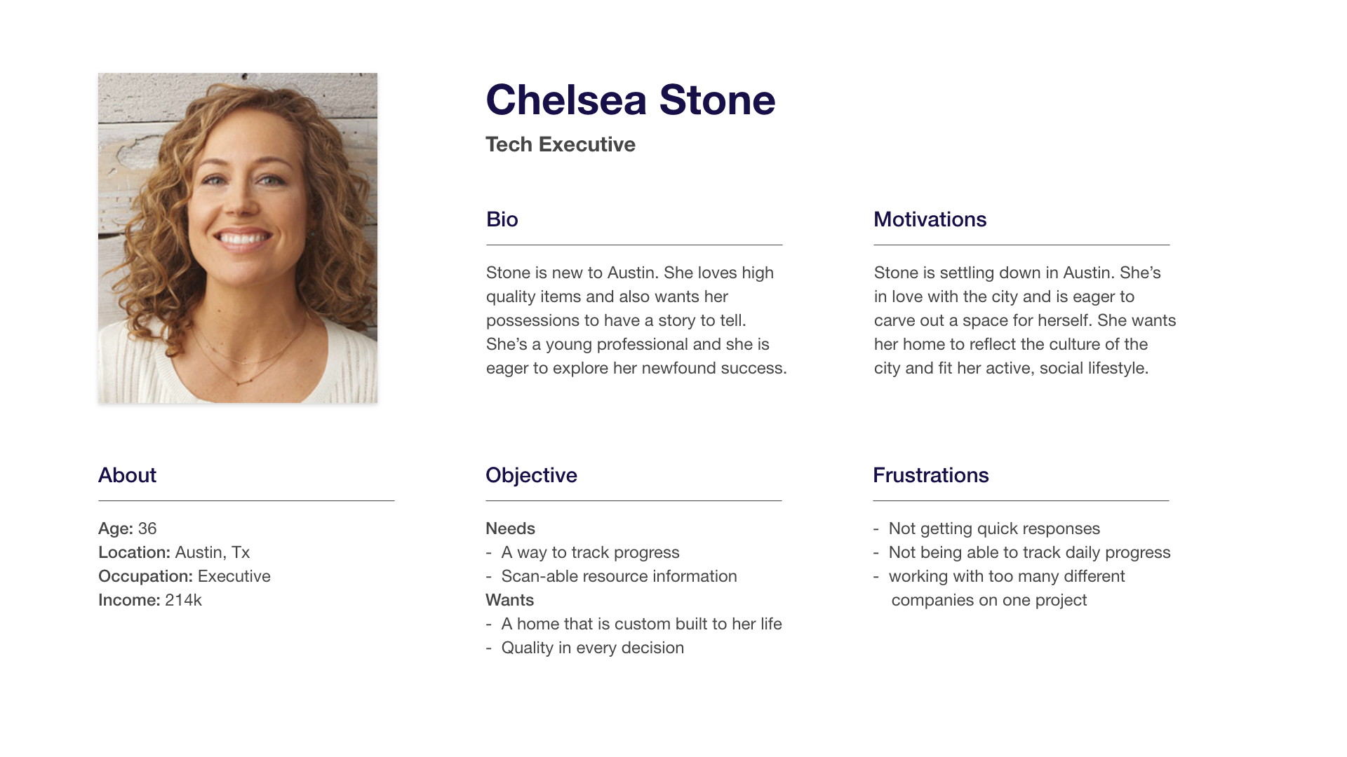
Personas
Wireframes and Testing
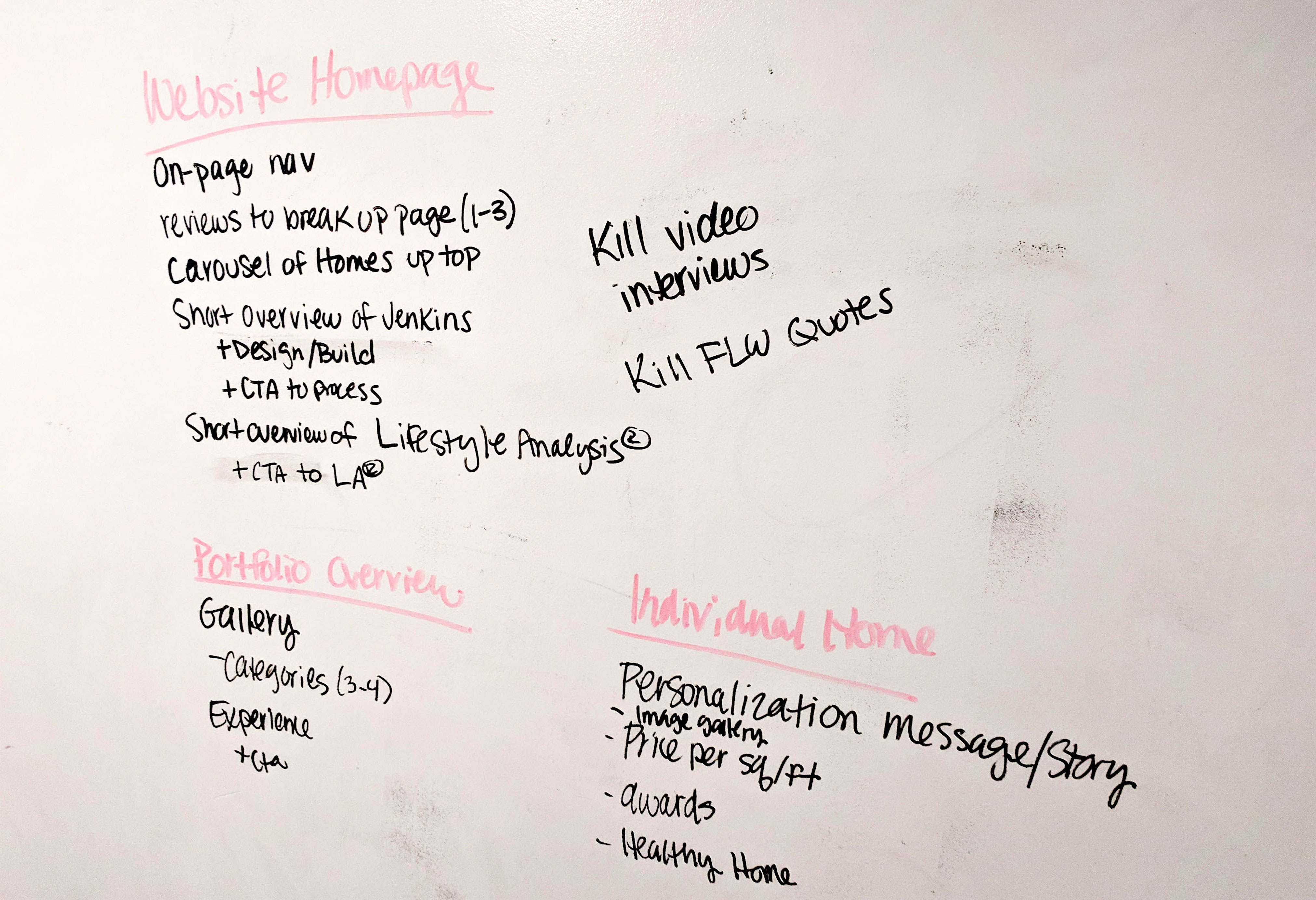
Our first tests were focused on getting users the right information and getting through to the individual showcased homes. Here are the results of testing and observations:
- Showcasing the homes on the webpage seems either too limited or too much.
- Makes sense to separate but need to separate sections to emphasize each one as unique.
- Sorting seemed like a good idea at first but there was too much variety in numbers between each sections. needed a new way to organize.
- There was going to me too many photos to showcase in such a large design. Maybe try a grid.
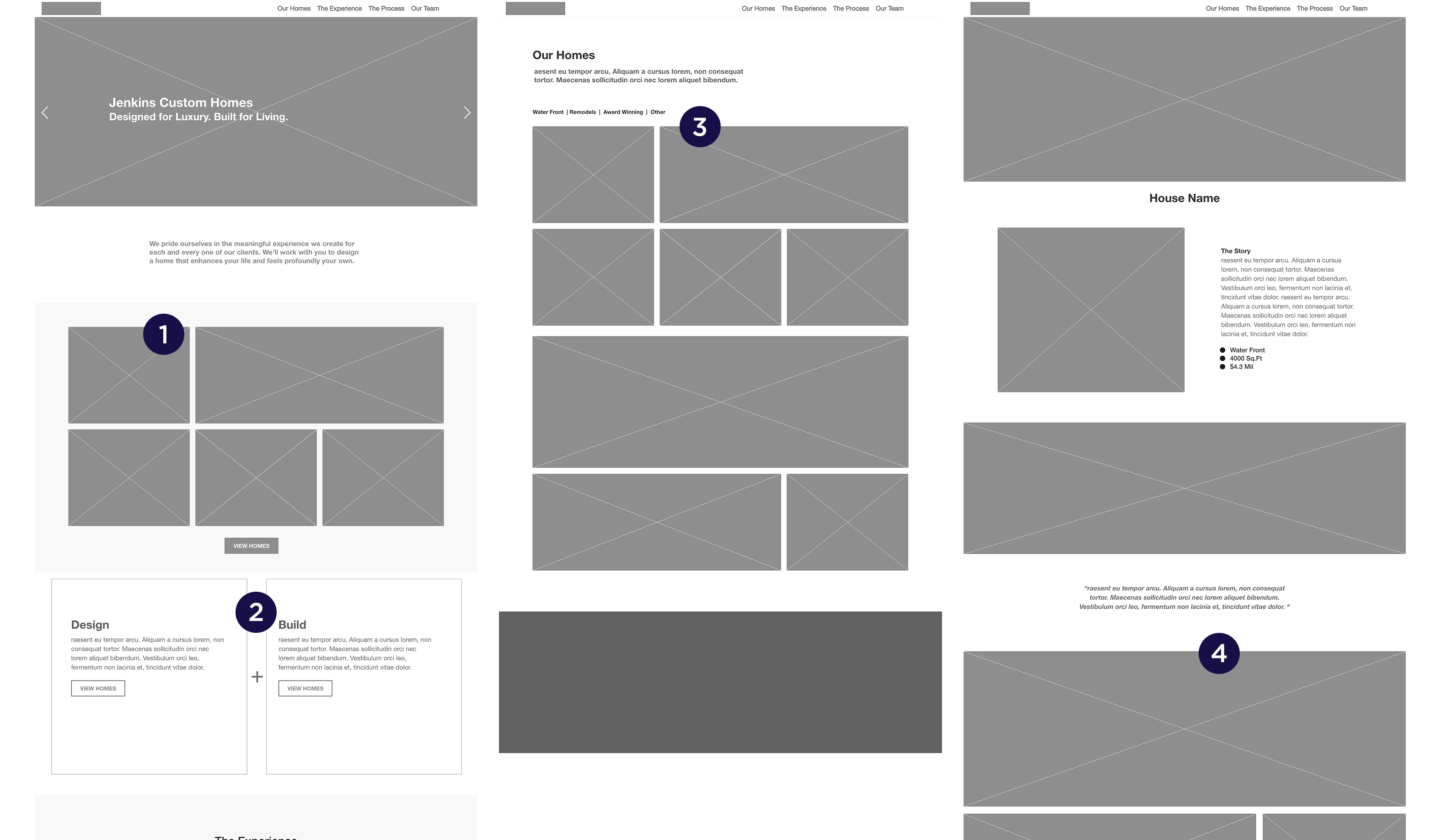
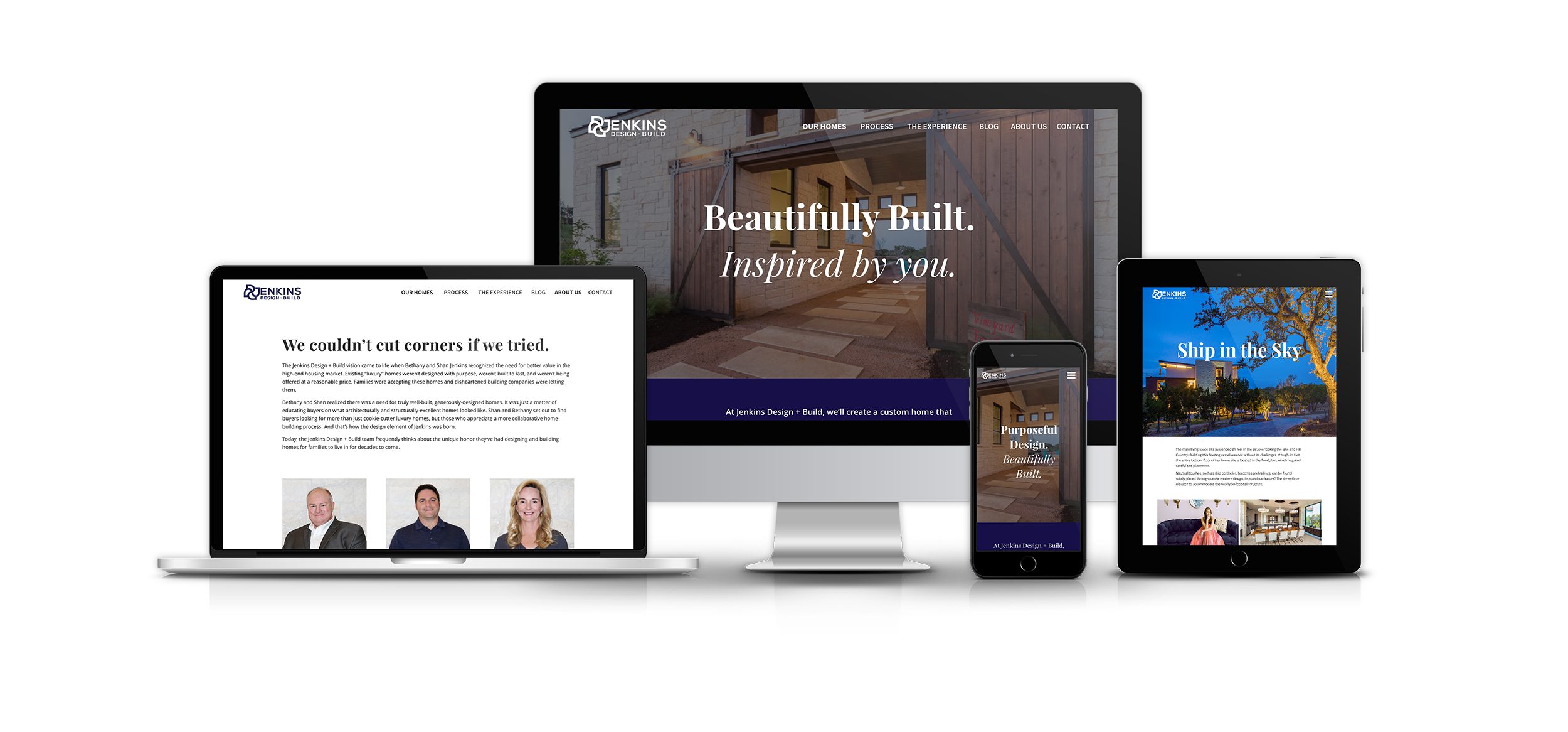
Final Designs
For our main pathway we took out the galley on the home page and had the first CTA point the users in the direction of the home showcase. From here we organized the "our homes" page into dropdown section categories. This created a cleaner experience on desktop and mobile. The individual home showcase had a curated grid of photos dispersed with client testimonials.